September Kit - is fearr déanta ná foirfe
Is fearr déanta ná foirfe - done is better than perfect. I first heard this phrase in a Facebook group for creative businesses. And it was an absolute lightbulb moment! I realised how often I was letting 'perfection' hold me back. How many times had I avoided posting on socials or trying out a new idea. But I also realised that it was true of my embroidery as well! I'm forever procrastinating creating a new design because I can't see it perfectly in my head. Or the amount of works in progress I have sitting in a drawer because it wasn't going quite right. But your first attempt (or even your second, or third) does not need to be perfect! It can be a stepping stone to something better - but it needs to be done to be a stepping stone.
And now I often tell my students this too. I come across so many people in my beginners courses who are just so hard on themselves. They want every stitch to be perfect. They're not allowing themselves to be beginners, to go through the process of learning. And that means getting something done is far better than getting something perfect!


This phrase was written on a post-it stuck to my studio wall for about 3 years. I knew I would stitch it eventually, but I hadn't yet decided whether it would be something just for myself, or something I would share with all of you. But I was looking for an idea for a text-based kit a few months ago. I like to do 2 or 3 of them each year. But of course, it has to be something a little bit Irish. The usual seanfhocail weren't really resonating with me. And then I saw it - the post-it!
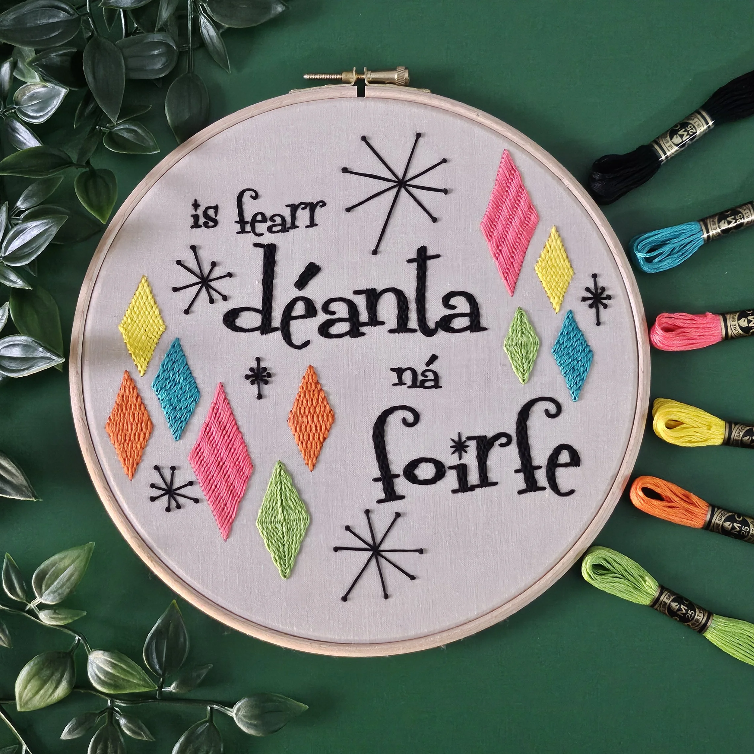
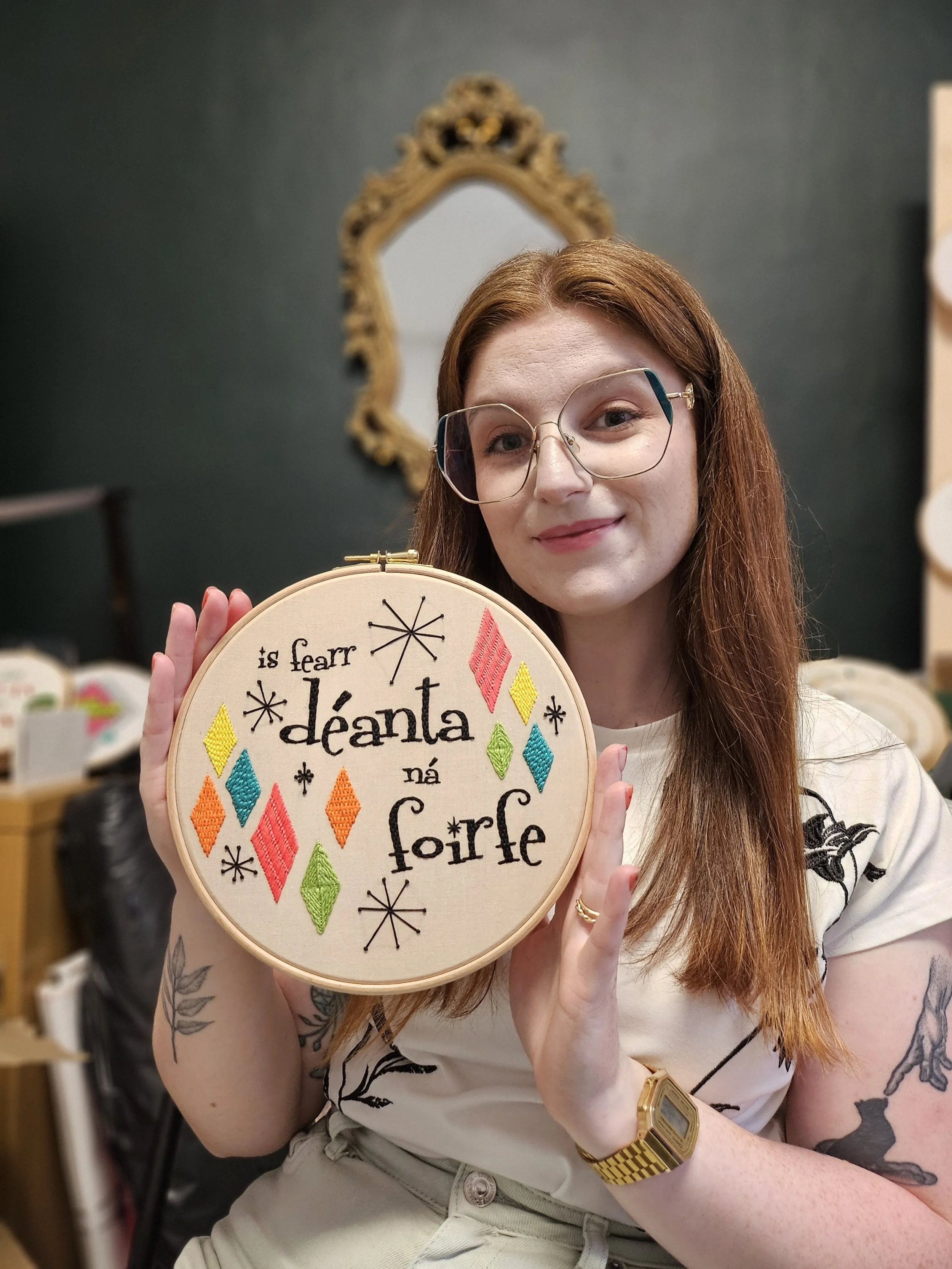
I knew I wanted to do a mid-century modern design. You know, that 1950s/diner/atomic sort of style. Like that old TV show Bewitched. I originally had this design not only with a completely different phrase, but a completely different layout and colour palette too. The diamonds and atomic stars were a must, but everything else changed multiple times! First the text was too small - I made it bigger and brought it to the centre. The new phrase was added. But the font was still off, so that changed too. Then the colour palette had to be updated. At first I was going to go with an orange/red/blue palette. But I knew the next kit would be completely orange toned (spoiler!) so that was out. I decided on the one you see now inspired by 1950s advertising aesthetics - kitchen appliances, plastic toys, colourful tupperware.
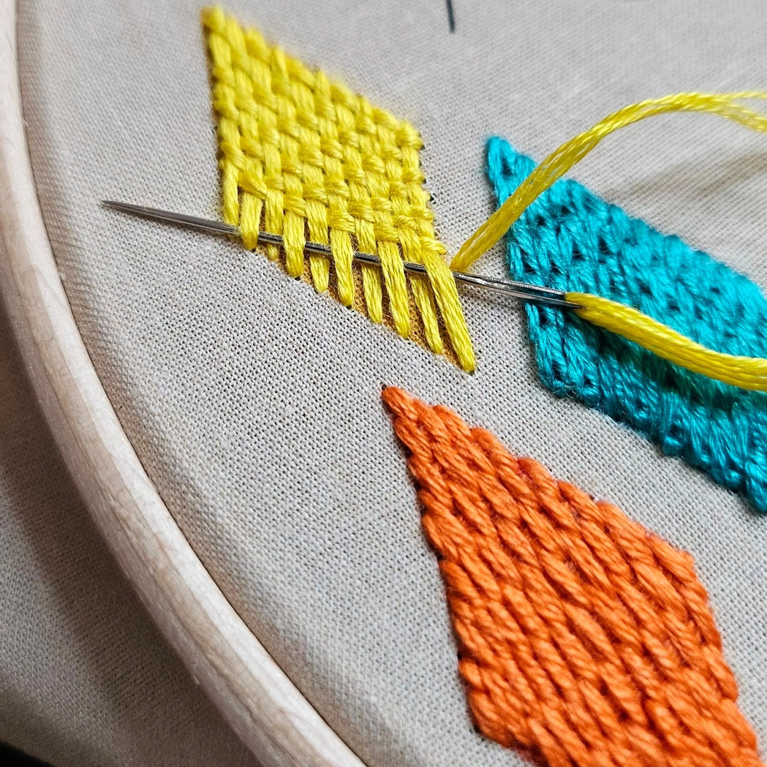
So, after all that, now we're ready to stitch! Each of the different colour diamonds are completed in a different stitch. We're really concentrating on creating different textures. There's chain stitch, couching, needleweaving - and 2 new stitches for be alice - burden and bokhara couching. The text is stitched with back-brick stitch. And the atomic stars are completed with lots of straight stitches and french knots. We're using up quite a bit of thread on this design too. Mostly using all 6 strands in the needle for some nice chunky stitches.